Drawing Realistic Textures With Just Enough Detail
There’s usually a patchwork of values under a texture, or the texture itself will have an overall value pattern. For a realistic look that doesn’t necessarily require a lot of detail, draw that value pattern first and then create texture in layered steps on top. Because the three-dimensional modeling is drawn first, you decide how much or how little detail is needed to make the texture look “real” in each situation.
Both of the techniques in these lessons give you control over how much detail to add and, the same basic steps can be used to create all types of textures. To create these textures you’ll need a medium smooth paper, 2H, B, and 2B pencils (or similar), a small brush or a stump, and a stick eraser.
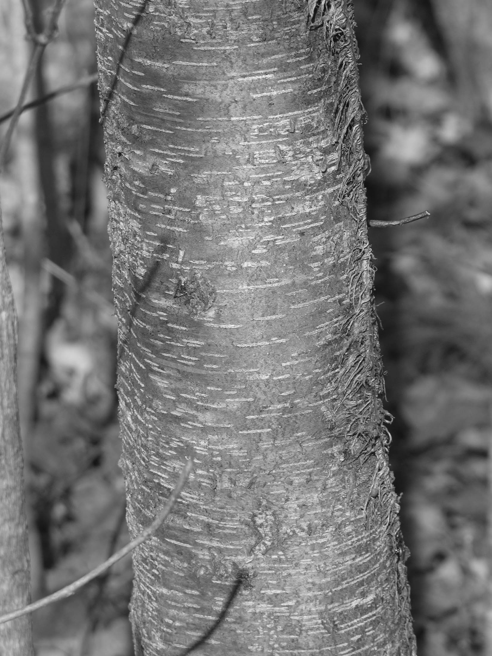
Smooth Tree Bark Texture – Wild Cherry Tree

The bark of this Wild Cherry tree is smooth, and it’s easy to see the underlying values that model the trunk. Draw those values first, and the rest of the texture can be realistically created using an eraser.
 You’ll need a value scale for both of these lessons, print it, and then trim the scale so that it doesn’t have any white borders around its edges. If you don’t want to draw from the screen, here’s a jpg to print so you can draw along with me as I take you through the steps to draw this texture.
 Step One – Value Areas Outlined
Hold the value scale next to the tree in the photo and look at the value patterns underneath its texture. You can see them better if you squint your eyes and blur the details. I’ve outlined those highlight and shadow areas in this photo. Either edge is about a “6” on the value scale, and the center section is about a “4”. (Because of the differences in computer screens and printers, you might see slightly different values than I do. That’s okay. You’ll still be able to create this texture by drawing the values as you see them, even if they are different from mine.)
 Using a B pencil, make a light outline drawing of this part of the tree, with the value areas outlined. There are three small limb shadows on the tree. Draw those shapes, also.
Step Two – Test Hatches
The pencil hardness needed to create a value depends a great deal on the texture of the paper, so experiment with your pencils and draw a few test hatches in the 3, 4, 5, and 6 value range. Next, use the brush or stump to smooth one half of each test hatch. Check it against the value scale to see how much it’s darkened.
After you’ve drawn for a while, you’ll get a very good “feel” for how much a hatch darkens when blended. Notice that the pencil hardness, the pressure on the brush or stump, how many times the area is hatched, and the texture of the paper all have an effect on how dark the hatch becomes.
 Step Three – Fill the Value Areas With Hatching
Using the correct pencil hardness as determined by your test hatches. Fill the areas of the trunk to slightly lighter values than you want them to end up. At the edges where the value meet, use your pencil tip to gradate the values into each other. Fill in the limb shadows to about an “8” value.
 Step Four – Blend and Smooth the Hatching
Working with either the brush or the stump, blend the hatching over the entire trunk. This will defuse the areas into each other. It’s possible to blend too much and lose the clearly defined value areas, so be sure to stop before that happens. If the graphite smears outside the trunk edges, and it probably will, just touch the smears with a clean eraser and they should lift off easily.
Don’t try to avoid the dark limb shadows. Blend over them as if they weren’t there. They won’t disappear, and you’ll darken them again later.
Step Five – Create Details
Use a knife to cut the stick eraser into a wedge shape.
 Place the edge of the wedge horizontally along the trunk and erase the horizontal lines with short, shallow arcing motions. The lines are made up of various shaped, slightly curved dashes, so vary the length, width, and placement of each line. Use a sharp corner of the wedge to make even smaller dots and dashes. Notice that the lines curve up and get closer together on both sides of the tree.
To create a more realistic looking texture, pretend that the small limb shadows aren’t there and erase the line details through them. Then draw the limb shadows over them again.
While comparing your drawing to the reference, use a medium hard pencil to slightly darken some of the details if they’re too bright. You can also reshape them with the tip of the pencil. The lines down the middle section should be the lightest.
Realistic drawing is done through comparison and correction. Details are drawn or erased, compared to the reference, and corrected until the drawing matches reality or the “feel” of reality is achieved.
Below is my drawing next to the photo reference. As you can see, it’s a simplified version of real thing. The texture lacks many of the smaller and more subtle details, but it still manages to look realistic because of the underlying modeling. Look closely, and you can see a similar value pattern on both tree trunks.
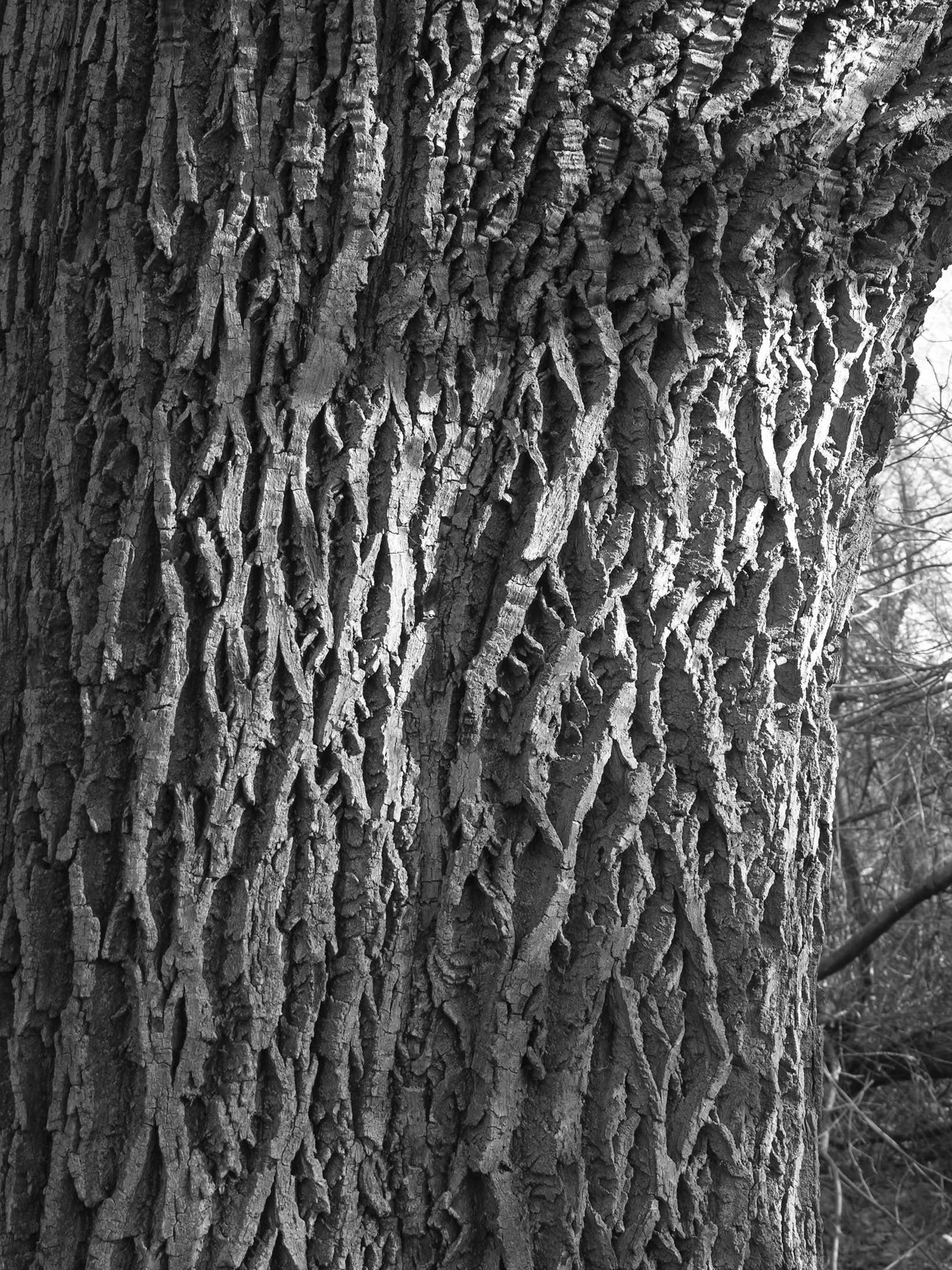
Rough Bark Texture – Ash Tree

This more complicated tree bark texture is created with a slightly different technique.
If you don’t want to draw from the screen, download and print an enlarged image from this link.
You’ll need the value scale too.
Step One – Line Drawing With Value Areas Outlined And Averaged

 Look at the reference until you see the different value areas that are outlined in the image to the far left.
Each area has its own range of values. Using a medium pencil, lightly draw the tree section and outline the value areas.
Use the value scale to find the lightest and darkest detail in each area. As in the last texture, you might find slightly different values than I did, and that’s OK, this technique will still work even if you use different values.
 Step Two – First Hatch
If you’re using the same paper as you did for the Cherry Tree bark, then you’ll have an idea of which pencils to use to create the first hatch fills.
Fill each section with a vertical hatch in the mid-range value of that section. For example, I hatched the areas marked 7-10 into about an 8 value, I filled the areas marked 6-10 with a slightly lighter value, and I hatched the areas marked 2-10 into about a 5 value.
Don’t blend this hatching. The roughness of the hatch marks will contribute to the textural effect.
 Step Three – Dark Details
While looking at the photo, hatch the darkest details of the bark groove texture with the B an 2B pencils. You don’t have to draw the details exactly as they are, but it does help to make the texture look realistic if you draw the grooves at about the same size and position. Working in one area at a time will help you do that by breaking the drawing down into to more manageable pieces.
 Step Four – Lightest Details
With the stick eraser cut into a wedge shape, erase the highlights of the bark detail by placing the wedge edge lengthwise and pulling it vertically down the bark ridges. You can also use one corner to erase some of the smaller highlight lines.
Remember that each area has a range of values, so referring to the reference photo during this step will help you get the highlight values in each area correct. If you erase an area too lightly, darken it back in by lightly tapping or stroking it with a 2H pencil. If you erase the wrong shape, and that can easily happen, redraw it with a B or 2B pencil.
Here’s my drawing side by side with the photo reference. You can see that I left out a lot of detail, my bark ridge shapes aren’t quite right, and everything is a little out of position and proportion. However, I still managed to capture the illusion of reality by creating a simplified texture over the underlying modeling of the trunk.


Here are a few things to remember when drawing a texture:
1. Look for the underlying value patterns by squinting your eyes. Then lightly outline them.
2. If the texture is not too complicated, hatch the areas to the actual value.
3. If the texture is heavily contrasted or deep, fill each part of the pattern to an averaged value.
4. For a smooth look, blend the hatching. For a rough look, leave it as it is.
5. Draw or erase details on top of these base values.
6. If the texture is complicated, alternate drawing dark details and erasing light details.
Happy Drawing!
Carol
Thank you for this tutorial! I was struggling to render the bark texture and this post helped immensely :)
Glad this lesson helped Una!
Carol